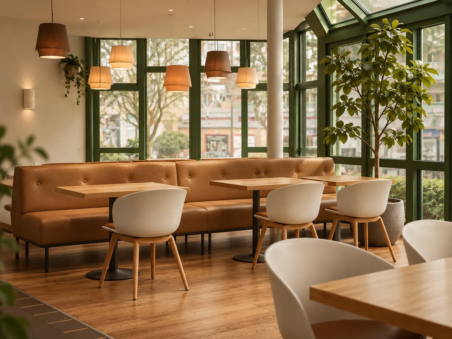
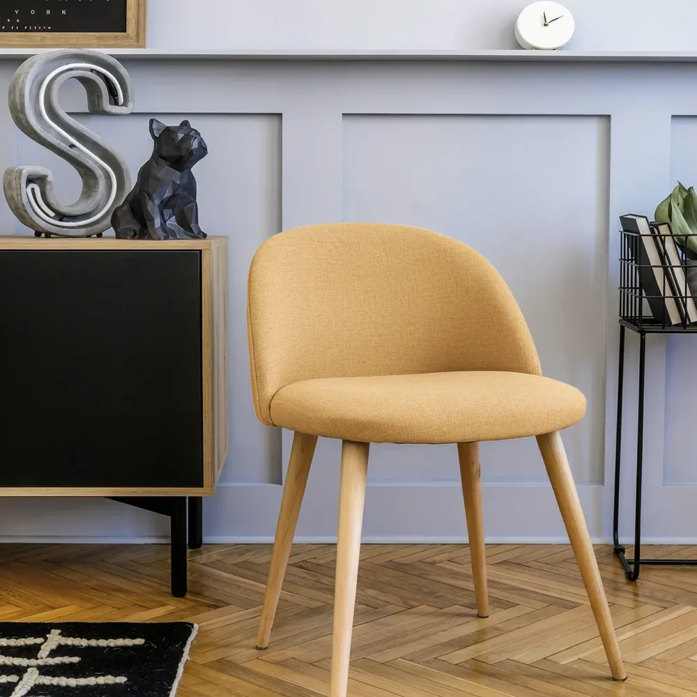
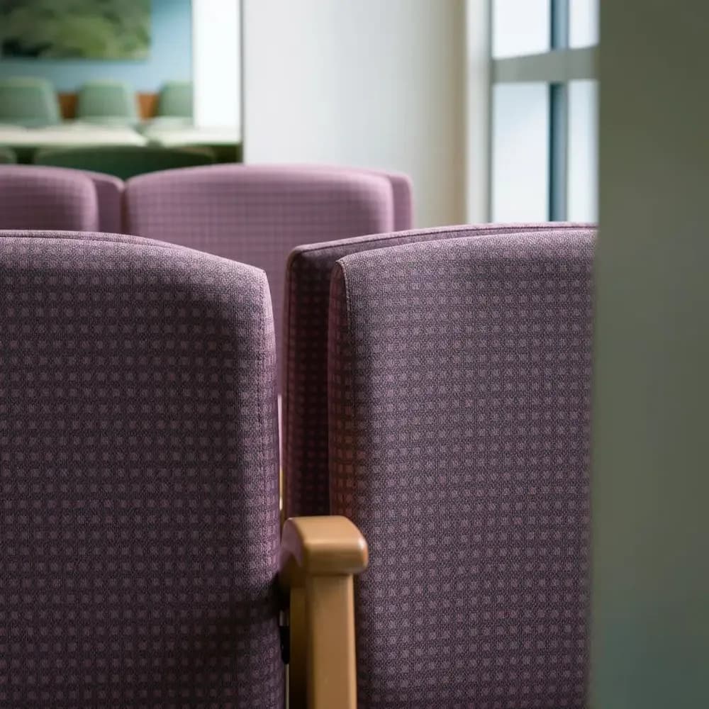
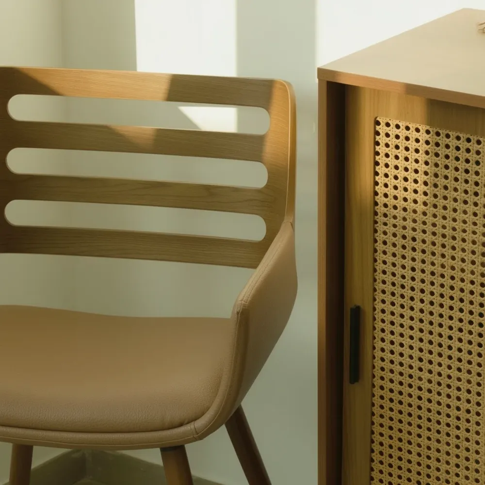
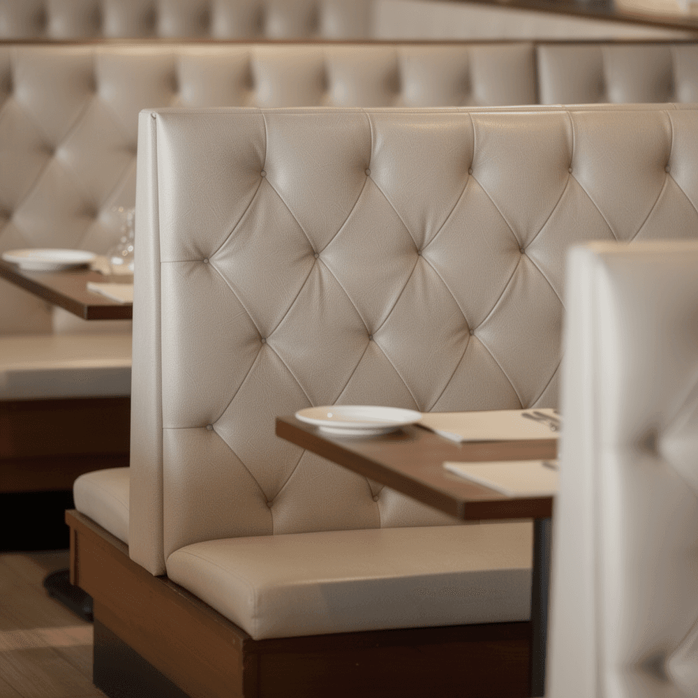
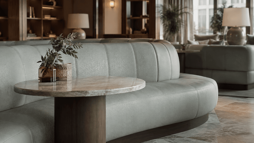
Walk into a hotel lobby in Manchester, a co-working space in Leeds or a restaurant in Birmingham and you might notice some familiar details: warm oak, softly textured upholstery, muted earthy tones and gentle lighting.
These choices are popular for good reason. They create inviting spaces, offer versatility and reflect a wider movement towards comfort and natural materials in contemporary interiors.
But it's striking how certain colours, textures and finishes become familiar across so many different settings. Design has always been shaped by shared influences, but the speed at which those influences now travel raises a question: when we draw on the same ideas, where does individuality come from?
How design influences travel
Interiors have always reflected the design movements of their time, from the clean lines of modernism to the rich colours and decorative details of Art Deco. What has changed is how quickly ideas can reach new audiences.
Social media, digital publications and online inspiration platforms allow a single project to be seen around the world almost instantly. Details that begin in one setting can soon influence interiors in entirely different cities and sectors.
In 2016, writer Kyle Chayka explored this phenomenon in his essay Welcome to AirSpace. He observed how cafés, workspaces and short-term rentals around the world were beginning to share a recognisable aesthetic, characterised at the time by reclaimed wood, exposed brick and industrial lighting. His observation went beyond the popularity of particular finishes. It explored how digital culture was influencing the physical environments we experience.
A decade later, the aesthetic has evolved. Industrial finishes have given way to softer forms, warmer palettes and more tactile materials. The influence of digital imagery, however, remains significant, with projects providing inspiration far beyond their original setting.
But images travel much faster than materials do.
A photograph can communicate colour, composition and atmosphere. It can't fully convey how a surface feels, how it responds to light or how it behaves through everyday use. And that distinction matters when inspiration becomes a real interior.
Why familiarity works
Shared influences are only part of the explanation. Certain design approaches also become familiar because they work particularly well in the environments they're chosen for.
Commercial interiors have responsibilities beyond appearance. Hotels need to accommodate different guests and expectations, workplaces must support different ways of working, and hospitality spaces need to balance atmosphere with the demands of daily use. A restrained palette can provide flexibility as a space evolves, while consistent finishes can create continuity across different areas or help establish a recognisable identity across multiple locations.
These are practical decisions rather than compromises in creativity, and they don't need to determine every aspect of a space. Within a familiar palette or established design approach, there's still plenty of room to create something specific to the setting.
Often, that difference comes from the materials themselves.
Where character begins
Two interiors can share a similar colour palette and create very different impressions. A warm neutral might feel soft and understated alongside natural timber, or more defined when paired with darker finishes and architectural forms. The difference isn't necessarily the colour, but how it's used and what surrounds it.
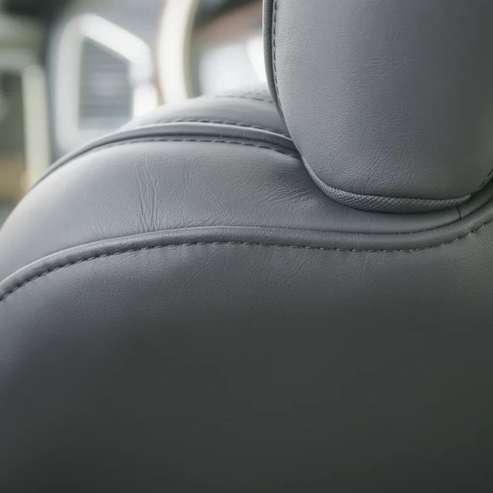
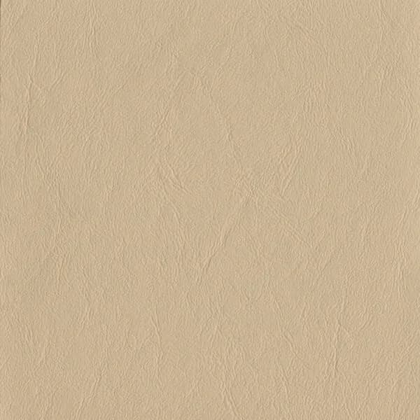
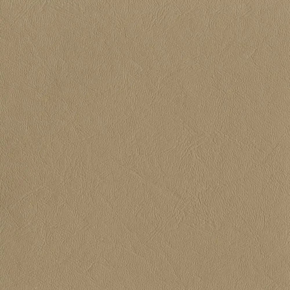
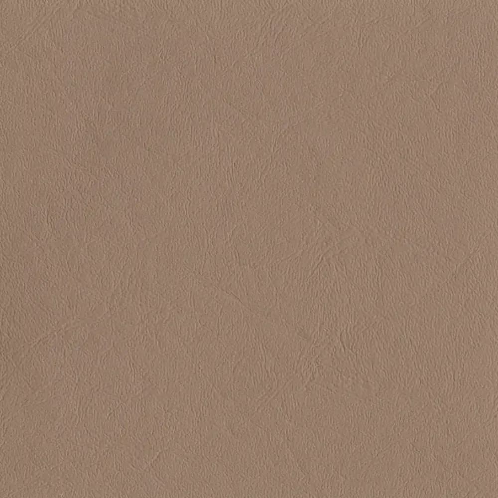
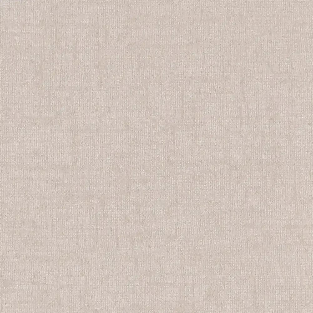
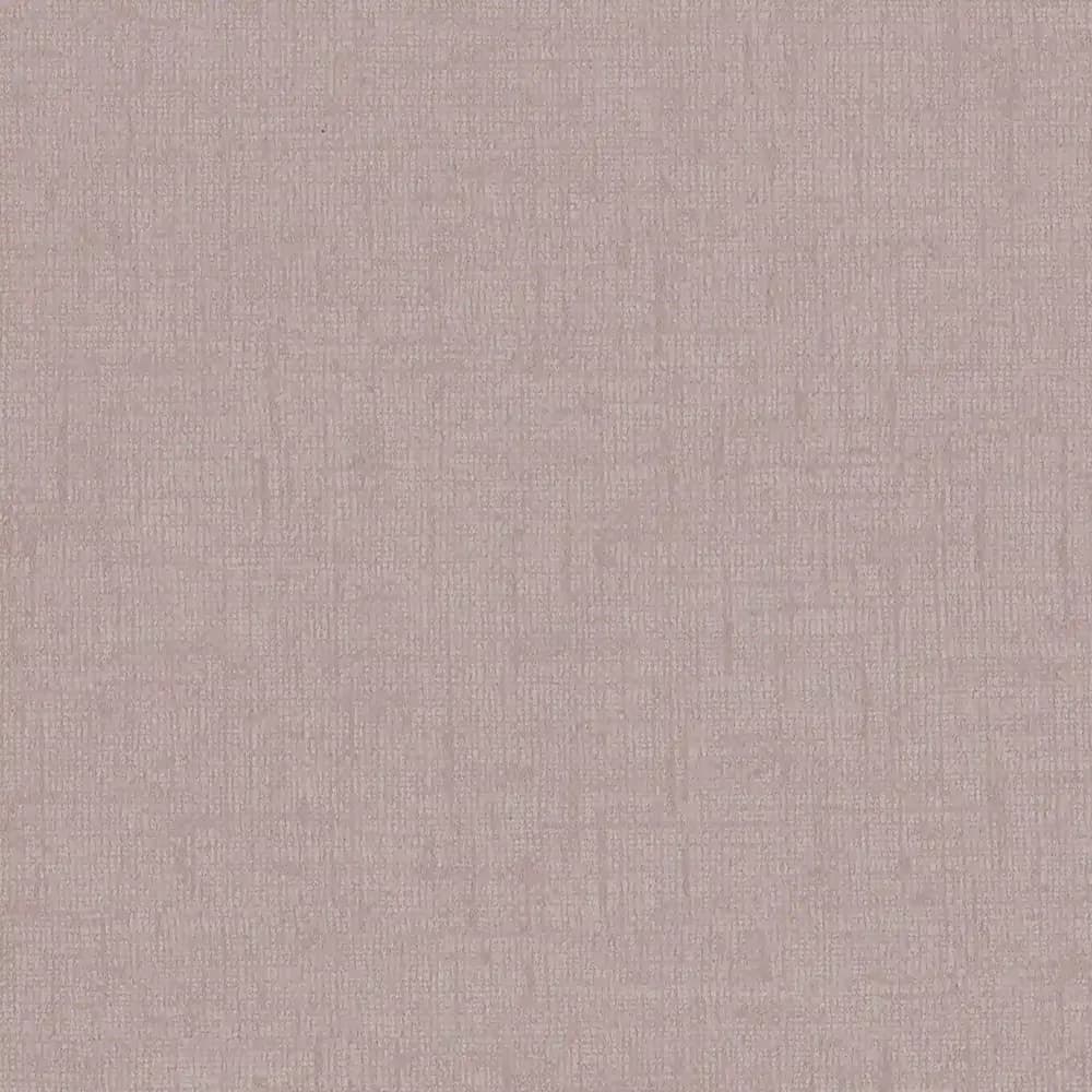
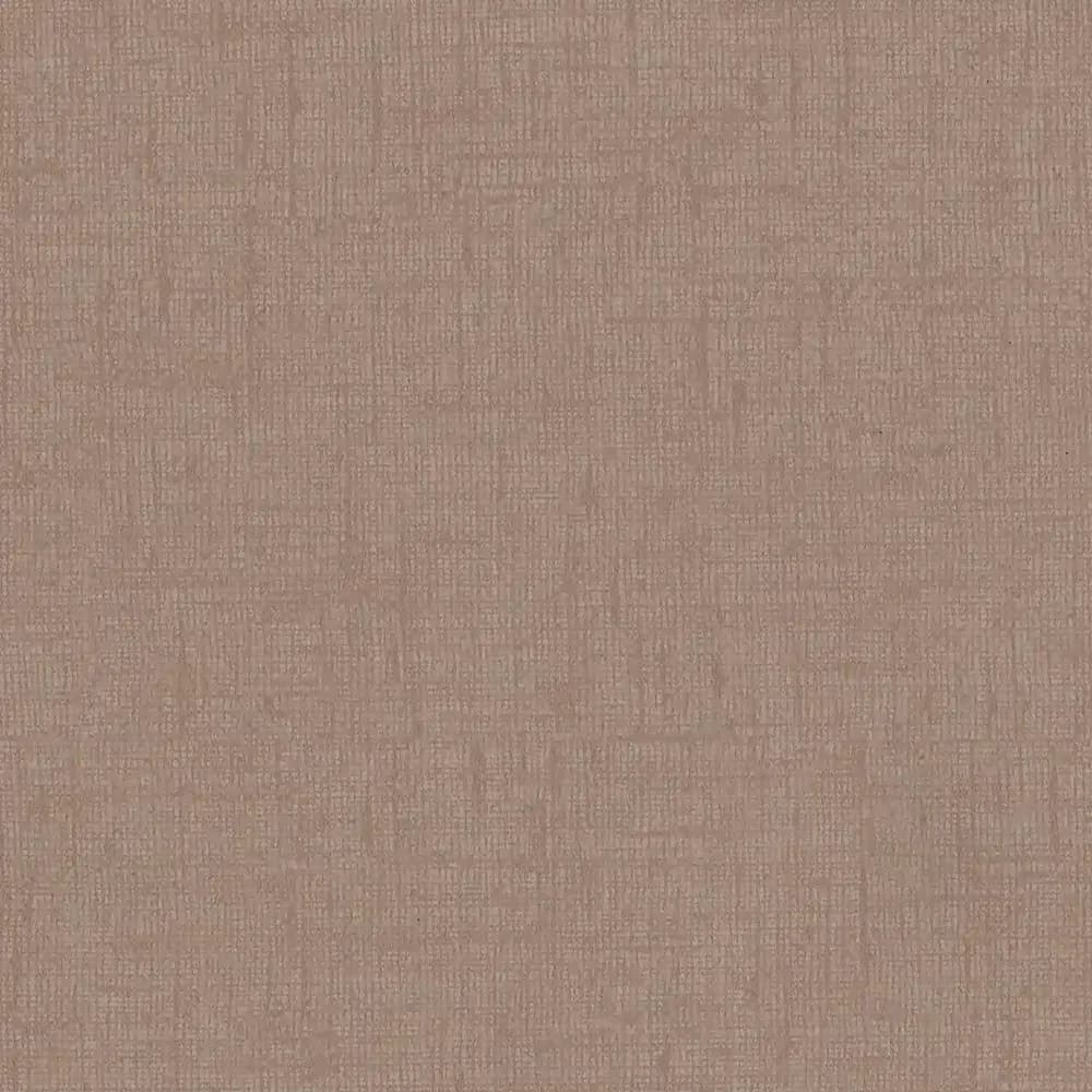
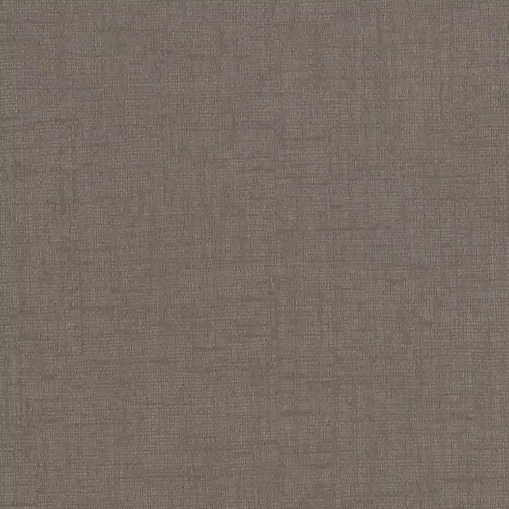
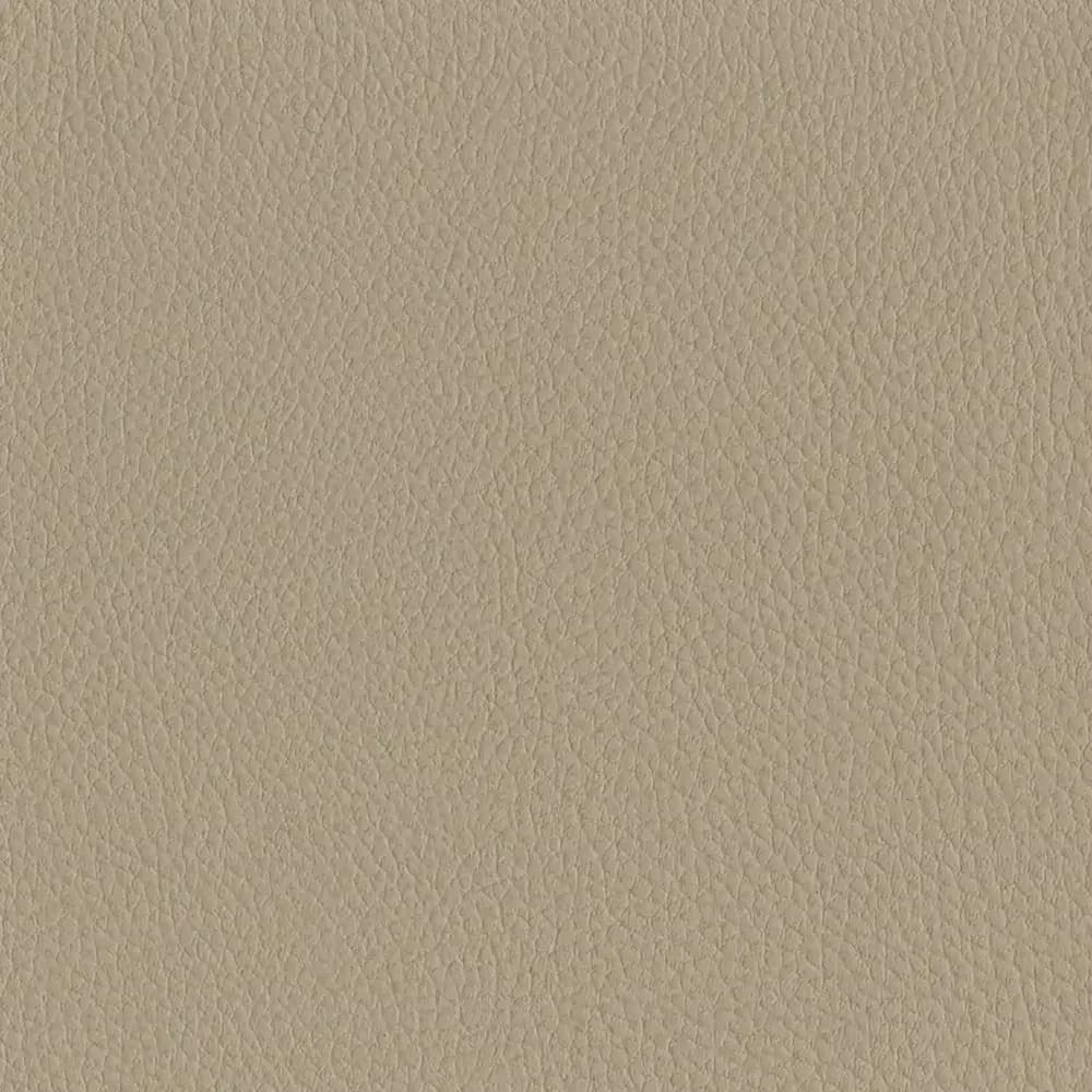
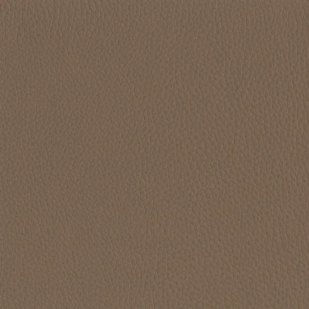
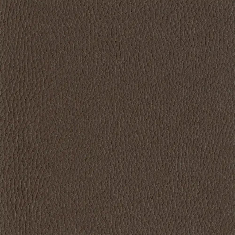
Surface texture adds another dimension. A smooth upholstery finish responds to light differently from one with a pronounced grain or textile-inspired pattern, and even materials in closely matched shades can offer different levels of depth. These distinctions are subtle, but they shape how an interior is experienced.
Physical samples make these details easier to see. Differences in grain, colour and finish become more apparent, particularly when materials are viewed together as part of a wider scheme.
That's where shared references become individual design decisions, with each material chosen for the contribution it makes to the space.
When design meets performance
A material might be chosen for its colour or texture, but its suitability depends on more than how it looks. In commercial settings, upholstery needs to withstand expected use, suit the cleaning regime and meet the relevant technical requirements.
Considering performance from the start keeps creative decisions achievable and avoids surprises later in the process.
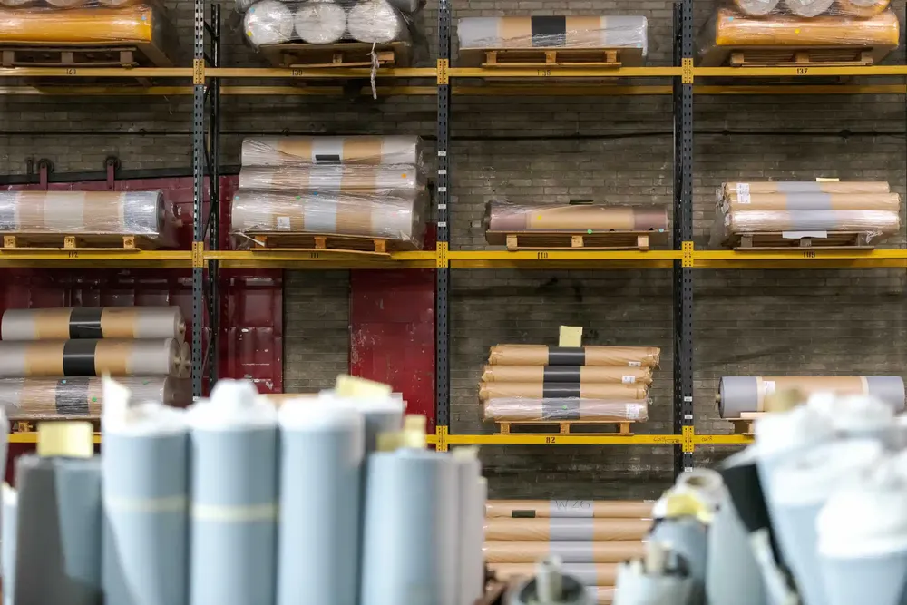
Coated fabrics are a useful example. Their surfaces can be developed with a variety of grains, textures and finishes, while their construction can be engineered to meet defined performance requirements. The right choice depends on the application and the verified properties of the specific material. Where an existing collection doesn't offer the required combination of appearance and performance, bespoke development may offer another possibility, subject to the project's technical requirements.
At Ambla, design and performance are part of the same process. Alongside established ranges, including the texture-led Wild Heather and Irish Linens, our in-house team supports the development of bespoke colours, embossings and surface finishes around individual project requirements. That might mean refining a shade to complement an architectural feature, adding texture to an otherwise restrained scheme or developing a consistent finish across different upholstered elements.
The aim isn't necessarily to make a material stand out, but to make sure it contributes to the wider design in the right way.
Making the familiar your own...
It’s fair to say that shared influences will always have a place in design. They introduce new ideas, encourage experimentation and create a common visual language that can be interpreted in different ways. And familiarity has value, particularly in spaces where comfort, consistency and practical performance matter.
Individuality doesn't require rejecting those qualities, but it may well come from the decisions made around them: how colours are combined, how surfaces interact, how materials respond to their setting and how the details support the overall intention.
For Ambla, this is where material design and manufacturing expertise come together: creating surfaces with character, developed to meet the practical demands of everyday use.
Because individuality isn't always about standing apart, sometimes it's about making the familiar feel as though it belongs.
If you’d like to discuss your next project with us please reach out on 01282 842511.