Insights
British-Made upholstery fabric: Does it actually make a difference?
The term ‘British-made upholstery fabric’ is often used as a simple label, but it actually means the material is designed, manufactured, and quality-checked here in the UK.
A softer approach to healthcare interiors
Healthcare design is becoming warmer, calmer and more considered. We look at the colours, textures and material choices helping to shape spaces that care for people as well as perform for them...
Healthcare interiors are some of the hardest-working spaces we design. They need to support rigorous standards of hygiene and maintenance, withstand continual use and remain practical for the people working within them. At the same time, they are occupied by people who may be waiting, recovering, receiving treatment or spending extended periods away from familiar surroundings.
How those spaces look and feel matters.
Rather than treating clinical performance and human comfort as opposing priorities, there is a real opportunity to consider them together.
Colour, texture, light and materiality can create spaces that feel calmer and more familiar, while carefully specified surfaces provide the durability, cleanability and practical performance happening quietly in the background.
The traditional visual language of healthcare is easy to recognise:
Many of these choices are rooted in genuine functional requirements. Others are simply the result of design decisions being made at different stages, or performance taking precedence over the interior as a whole. Either way, a space designed to work hard does not have to look overtly institutional.
There are signs of this thinking becoming more established.
For example, the NHS’s current design and performance specification for neighbourhood health centres considers the following important to creating more welcoming, inclusive healthcare environments:
These sit alongside the practical requirements of healthcare, with waiting and shared areas described as spaces that should feel calm and appropriately scaled, and public areas designed to feel familiar and non-institutional.
Material selection becomes much more interesting when viewed through this lens: the question is no longer simply whether something is suitable for healthcare, but what it contributes to the experience of the space as a whole.
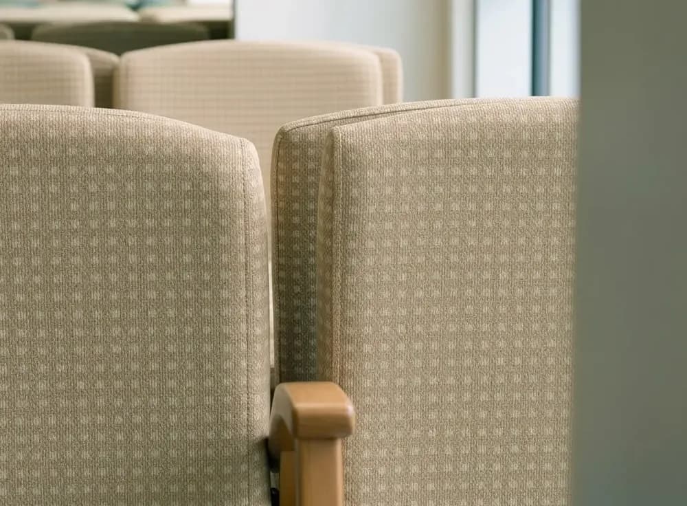
A waiting area might pair warm timber with softly textured upholstery in moss, clay or mineral tones, using smaller seating groups to create a more relaxed setting. Elsewhere, quieter neutrals and muted blues could provide a restrained backdrop for artwork, planting or views outside, while richer accent colours might bring identity to particular areas or help distinguish one space from another.
The possibilities will differ from one environment to the next, but the principle remains the same: performance can sit within the design, rather than define it.
Crucially, from our perspective, comfort in healthcare is not simply about introducing more soft furnishings. Many environments necessarily contain hard, cleanable surfaces, specialist equipment and functional elements that cannot be disguised. The real opportunity is to create balance around them.
Upholstery can play an important role because it introduces colour, grain and tactility at the points where people physically interact with a space. A subtle leather-effect grain might bring familiarity to seating in a consultation or waiting area, while a textile-inspired surface can soften the appearance of larger furniture installations without introducing the same maintenance considerations as a woven textile.
Material combinations matter too. Upholstery does not exist in isolation, and some of the most convincing healthcare interiors take their character from the relationship between surfaces:
Deeper or more saturated tones used selectively to distinguish seating areas, introduce identity or provide useful visual contrast.
The aim is not to make a healthcare environment resemble a hotel or a home. It is to borrow some of the qualities that make those spaces feel considered and comfortable, while retaining the clarity and practicality healthcare demands.
There is no universal colour palette for a calming healthcare environment. Different settings, users and activities require different responses, which makes context more useful than convention.
A children's environment, for example, may allow for more confident colour and moments of playfulness. A specialist treatment centre may call for something quieter. Environments designed for people living with dementia or sensory sensitivities introduce further considerations around contrast, pattern, glare and visual clarity.
This is another area where the latest NHS guidance is useful. Rather than prescribing a particular aesthetic, it considers consistent colour cues, avoidance of confusing patterns and visual clutter, sensory comfort and intuitive wayfinding as part of inclusive design.
Thinking in terms of atmosphere and use, rather than reaching automatically for a familiar sector palette, gives an interior greater individuality. It also allows upholstery to become part of the architecture of the room rather than something selected after the wider scheme has already been decided.
Nature is another recurring influence in contemporary healthcare design. Sometimes that connection is literal, through planting, courtyards, landscape views and access to daylight. In other spaces, it can be expressed more subtly through colour, texture and material combinations.
Again, this is more than a stylistic trend. NHS England's neighbourhood health centre principles place natural light, views outside and biophilia within a wider approach to creating inclusive, healthy and non-institutional environments.
The design response does not need to become an overt interpretation of nature. It could be as simple as:
Often, it is the cumulative relationship between light, colour, furniture and surface that creates the atmosphere, rather than any one feature declaring itself as ‘biophilic design’.
However, considered the atmosphere, healthcare materials still have serious work to do. Seating is occupied repeatedly, surfaces are touched constantly and cleaning is routine rather than occasional.
NHS England's Health Building Note 00-09: Infection control in the built environment makes the principle clear: infection prevention and control should be designed into a project from the beginning, including the creation of environments that are easy to clean and maintain.
This is where performance and aesthetics become difficult to separate. A colour or texture is only successful if the surface can continue to perform in the environment for which it was chosen.
Ambla coated fabrics are designed for demanding everyday use and incorporate an antimicrobial additive within multiple layers of the material rather than relying solely on a surface treatment. The material is designed to resist and inhibit the growth of microorganisms, supporting applications where hygiene and cleanliness are important.
These technical characteristics do not need to dictate the visual character of a space. Ideally, they provide the foundation that allows colour, texture and finish to be considered more freely.
Perhaps one of the most useful questions at the beginning of a healthcare project is not simply how an interior will look when it opens, but how it will look after years of use.
A carefully resolved scheme can gradually lose its character if individual surfaces deteriorate prematurely. Upholstery that wears poorly or needs early replacement can affect more than a piece of furniture; substitutions and piecemeal refurbishment can slowly alter the relationship between colours and finishes that made the original interior work.
That makes it worth considering several questions together at the point of material selection:
Longevity therefore has an aesthetic consequence as well as a practical one. Materials that remain serviceable and retain their appearance help preserve the original design intent for longer. In a sector where spaces are expected to work hard every day, that is an important part of creating an interior that feels considered rather than simply new.
We believe the most successful healthcare interiors don't make people choose between a space that feels considered and one that performs properly. The technical requirements should form the foundation of the design, not become its visual identity.
That thinking informs how we approach our own materials. Ambla coated fabrics are made in Lancashire for demanding everyday environments, bringing together durability and practical performance with a considered approach to colour, texture and finish. For healthcare interiors, that means giving the practical requirements the attention they deserve while leaving room for a much more human design response.
Because a material can work hard without making the space around it feel hard.
Healthcare upholstery needs to balance durability, cleanability and practical performance with the colour, texture and comfort of the wider interior.
Yes. Carefully chosen colour, grain and texture can create a warmer, more considered feel while still providing the practical performance the environment requires.
There is no single palette that works for every healthcare setting. Colour should respond to the space, its users and the atmosphere being created, rather than relying on a traditional ‘healthcare palette’.
Healthcare seating can experience continual use and frequent cleaning. Choosing materials that retain their appearance and performance over time can help preserve the original design intent for longer.
Yes. Ambla coated fabrics incorporate an antimicrobial additive within multiple layers of the material, designed to resist and inhibit the growth of microorganisms.
Consider the expected use, cleaning requirements and relevant performance needs alongside colour, grain and texture. Physical samples can also help you see how the material works with the wider interior scheme.
Thoughtful perspectives on materials, environments and the standards that define them. Where material knowledge meets real-world application across the sectors we serve.
The term ‘British-made upholstery fabric’ is often used as a simple label, but it actually means the material is designed, manufactured, and quality-checked here in the UK.

Vinyl-coated fabrics are widely used across sectors such as healthcare, hospitality, and transport because they are durable and easy to clean. But not all coated fabrics handle installation the same way.
Healthcare interiors present a complex design challenge; spaces must meet strict hygiene and safety standards while still supporting patient comfort and dignity.